The request and the trap
Every organisation that publishes an architecture portal wants it to look like theirs. The request arrives as a hex code from the brand guidelines and a logo, and it seems trivial. It becomes a problem the moment that colour is used for text.
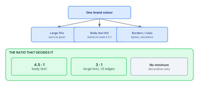
Corporate colours are chosen for large-format use — a header band, a cover slide, a wall. Many are chosen specifically to be vivid, which usually means mid-luminance. Mid-luminance colours fail contrast checks against both white and dark backgrounds when used at body-text size.
Why not just ask for two colours
The obvious fix is to ask the customer for an accessible text colour alongside their brand colour. In practice this fails for a mundane reason: it introduces a second value that has to be maintained, agreed with brand, and kept in step. Six months later someone updates the brand colour and not the text tint, and the portal quietly goes out of compliance.
Deriving the text tint from the brand colour removes that failure mode entirely. There is one input, and everything else follows from it.
What the requirement actually is
WCAG 2.1 AA asks for a contrast ratio of at least 4.5:1 between body text and its background, and 3:1 for large text and for the boundaries of user-interface components. Purely decorative elements have no minimum.
The important consequence is that the same colour can be perfectly acceptable as a 60-pixel header band and unacceptable as 14-pixel body text on the same page. The colour is not the problem; the role is.
Deriving the tint
The mechanic is straightforward. Compute the relative luminance of the brand colour, compute its contrast against the intended background, and if it falls short, darken (or lighten) it along its own hue until it passes. Because you move along the hue rather than towards grey, the result still reads as the brand colour to anyone who is not holding a swatch next to it.
def relative_luminance(rgb):
    def channel(c):
        c = c / 255
        return c / 12.92 if c <= 0.03928 else ((c + 0.055) / 1.055) ** 2.4
    r, g, b = (channel(v) for v in rgb)
    return 0.2126 * r + 0.7152 * g + 0.0722 * b

def contrast(a, b):
    la, lb = relative_luminance(a), relative_luminance(b)
    lighter, darker = max(la, lb), min(la, lb)
    return (lighter + 0.05) / (darker + 0.05)
Then step the colour towards black in small increments until contrast(tint, background) >= 4.5. Typically two or three steps are enough, and the shift is not perceptible in isolation.
Put the derivation behind tokens, not colours
The derivation produces values; the discipline that keeps them working is where those values live. The portal's stylesheets should never mention the brand colour, its tint, or any hex code at all. They mention roles: --colour-accent, --colour-accent-text, --colour-accent-surface, --colour-focus. The generation step computes each role's value from the single configured input and writes them once, as CSS custom properties at the root of every page.
This sounds like frontend housekeeping and is actually the load-bearing wall. The moment a template hard-codes one tint "because it looked right", that value has left the derivation and will not update when the brand colour does — the second-palette problem sneaking back in through the templates. A build-time check keeps everyone honest: grep the generated CSS and templates for hex literals outside the token block, and fail the build on any hit. It is a one-line rule that has caught more regressions in our portals than any visual review, because a wrong colour looks fine to everyone who does not know it is wrong.
Naming by role rather than by appearance also survives redesigns. --colour-accent-text still means something when the accent changes from blue to green; --colour-blue-dark becomes a small lie that every future maintainer has to learn. This is the same argument as any design-token system, compressed to the scale a portal needs — a dozen roles, one input, zero judgement calls at template time.
One colour becomes a ramp
Body-text tint is the urgent derivation and not the only one. A working portal needs the brand colour in perhaps eight strengths: a wash for panel backgrounds, a pale tint for hover states, the authentic colour for bands and accents, a text-safe dark for links and headings, something darker still for the link's own hover. Design systems call this a ramp, and the good news is that a serviceable ramp can be generated the same way as the text tint: hold the hue, move the luminance to a set of fixed targets, and check each step's contrast against the roles it will serve.
Fixed luminance targets are the trick that makes ramps comparable across customers. If the "700" step always lands near the same luminance, then every customer's link colour passes 4.5:1 for the same reason, whether their brand is navy, burgundy or that particular orange that fails against everything. The vivid mid-luminance brands compress at the light end of their ramp and stretch at the dark end; the already-dark brands do the opposite; the code does not care. What you give up is the hand-tuned optical adjustment a design team would make for a flagship product — and for a generated portal serving forty organisations from one codebase, that trade is not close.
Interactive states come from the ramp too, mechanically: hover is one step down, active two, disabled is the tint at reduced opacity on the surface colour. Deriving them means never shipping the classic defect where a button's resting state passes contrast and its hover state does not — the states move together because they are the same colour at different positions on one ramp.
Where portals still fail
Getting the text tint right removes the biggest problem. Three others survive it and are worth checking explicitly:
- Diagram fills. Layer colours in generated diagrams need the same treatment. A pale tint with a mid-tone label on top is a common and easily missed failure.
- Status colours. Red/amber/green carries meaning that vanishes for colour-blind readers. Pair it with a label or an icon; colour alone is not an accessible encoding.
- Focus indicators. A portal that removes the default focus outline for aesthetics becomes unusable by keyboard. If you restyle it, keep it visible at 3:1 against its surroundings.
Testing it
Automated checkers catch the mechanical failures and are worth running in the build. They will not catch meaning conveyed only by colour, and they will not catch a diagram whose labels are illegible at the size the page actually renders them.
The manual check that finds the most, fastest: open the portal, set the browser to 200% zoom, and try to complete one real task using only the keyboard. Almost every accessibility defect that matters shows up in that one exercise.
Where the raw colour still belongs
None of this argues for banishing the authentic brand colour, and a portal that renders everything in compliance-adjusted tints reads as slightly off to the people who know the brand best. The raw colour belongs everywhere it was designed for: the header band, the hero panel, the accent rule under a section title, the logo's own field. These are large, decorative, and carry no text at body size — exactly the roles WCAG leaves unconstrained, and exactly the roles brand guidelines were written around.
The working rule fits in a sentence: the brand colour as paint, the derived tint as ink. Paint goes on surfaces; ink carries words. Templates that respect the distinction get to be both compliant and recognisably the customer's, which is the whole brief — the trap was never the colour, it was letting one value do both jobs.
Print, PDF and the other renderings
Portals get printed more than anyone expects — review packs, audit annexes, the architecture section pasted into a steering-committee deck. Every one of those is a rendering the browser's careful token system no longer controls, and two failures recur.
The first is pale-on-white: tints that read as structure on screen vanish on a monochrome office printer, taking table zebra-striping and status chips with them. A print stylesheet that swaps surfaces to white, text to near-black and keeps borders is twenty lines and rescues the review pack. The second is the document exports themselves — if the pipeline also generates Word or PDF deliverables from the same models, those templates need the same derived tokens, not a colour scheme frozen in a template file three years ago. One derivation feeding screen, print and document exports is the same argument as one derivation feeding light mode; the moment any rendering keeps its own palette, that rendering is where the brand refresh will be forgotten.
Who owns the colour
Finally, the governance question, which is smaller than it sounds precisely because the derivation exists. The brand colour is configuration — one value, owned by whoever owns the portal's relationship with brand, changed without touching code and picked up by the next scheduled publication. When the organisation refreshes its identity, the change is: update one hex value, let the pipeline regenerate, glance at the portal. Every tint, ramp step, hover state, diagram fill and print style follows, and the contrast checks in the build confirm the new colour's derivations pass before anything reaches readers.
Compare that with the alternative that most portals live: a rebrand ticket that lists every template, stylesheet and export that mentions a colour, assigned to whoever last touched the generator. The list is always incomplete, the portal wears two brands for a quarter, and accessibility is re-audited from scratch because nobody can say which values were re-derived and which were guessed. One input, derived everything: it is the difference between a rebrand being an afternoon and being a project.
A worked example
To make the derivation concrete, take a vivid corporate orange — #E8590C, the kind of colour a brand team chooses precisely because it carries across a conference hall. Its relative luminance works out around 0.28, which puts its contrast against a white page at roughly 3.2:1 — comfortably past the 3:1 required for large text and interface boundaries, and comfortably short of the 4.5:1 that body text needs. Used as a header band it is fully compliant; used as link text it fails, and it fails in the way that matters, on the fourteen-pixel line a reader is actually trying to read.
Run the derivation: hold the hue and saturation, step the lightness down until the ratio crosses 4.5. Two steps land near #B84607 at 4.7:1 — visibly the same orange in any context except a side-by-side swatch comparison, which no reader ever performs. The ramp then falls out of the same arithmetic:
| Token | Value | Contrast on white | Used for |
|---|---|---|---|
accent-surface | #FDEEE3 | 1.1:1 | Panel washes, hover backgrounds |
accent | #E8590C | 3.2:1 | Bands, accents, large headings |
accent-text | #B84607 | 4.7:1 | Links, body-size emphasis |
accent-strong | #8F3605 | 6.8:1 | Link hover, small labels |
Four values, zero judgement calls, and the whole table regenerates the day the input changes. This exact exercise, performed by hand for one customer, takes a designer an hour and produces values nobody dares touch afterwards; performed in code it takes milliseconds and produces values nobody needs to touch. That asymmetry is the entire argument of this article in one table.
Dark mode, and whether to bother
A request that arrives eventually. It is worth doing only if the derivation described above is already in place, because dark mode doubles every contrast decision.
The trap is that a brand colour which passes against white frequently fails against a dark background, and in the opposite direction — it needs lightening rather than darkening. If your tint is derived rather than hard-coded, that is one function call with a different background parameter. If it is a hex code someone chose, it is a second palette to maintain, which is exactly what the derivation existed to avoid.
Heatmaps and the one legitimate second palette
One family of colours genuinely cannot be derived from the brand: the semantic ones. Lifecycle heatmaps, risk overlays, RAG statuses on a capability map — these encode meaning, and their meaning must stay stable across every customer and every rebrand. A portal where "retire" is rendered in whatever the brand ramp produced is a portal where the same capability map means different things in different organisations, which defeats the point of a shared visual language.
So the rule splits cleanly in two. Brand colours are per-customer and derived; semantic colours are global, fixed, and chosen once with more care than usual. Chosen means: distinguishable by the eight per cent of male readers with red-green colour vision deficiency, which classic traffic-light red and green are not. The workable versions shift red towards vermilion and green towards a bluish teal, keep amber genuinely light, and — the non-negotiable part — never let colour carry the meaning alone. A lifecycle chip that reads "Retiring" in text, on a tinted background, with the tint merely reinforcing, works for every reader and photocopies correctly, which the coloured dot on its own never did.
The two palettes also must not collide. If the brand happens to be red, a risk overlay in semantic red suddenly looks like branding, and vice versa. The practical guard is to keep semantic fills visually distinct in construction — paler, chip-shaped, always labelled — so the reader's eye learns that saturated bands are decoration and labelled chips are data. It is a small convention that pays off every time a heatmap lands in a steering deck next to the branded header, and the two read as different layers of information rather than as one confused palette.
Diagrams are the accessibility blind spot
Text contrast gets checked. Diagrams generally do not, and they are where published architecture portals most often fail.
Three specific failures, all common:
- Pale fills with mid-tone labels. A tint chosen to look subtle behind a 10-pixel label frequently lands around 3:1.
- Status by colour alone. A red box and a green box are the same box to a significant minority of readers. Add a label, a border style or an icon.
- No text alternative. A complex architecture diagram needs more than
alt="diagram". If the portal also lists the elements on the diagram as text — which it should, for search — that list is the accessible alternative, and linking the two is nearly free.